

Earlier this year I went to London for a couple of days of vacation. And, as the Mac addict I am, I "had to" visit the Apples Stores. The first one I visited was the one in Regent Street, and after spending some time there I decided to buy an iPad. I had definitely thought about it before arriving, but when I'd played around with it for a while I decided.
I also visited the new Apple Store in Covent Garden, and added some accessories to my iPad. The store was great by the way: Huge, well organized and with a very friendly and efficient staff. The store was packed with people wanting the new iPhone 4.
So why do I tell you this? Well, as I started to play around with the iPad, I soon realized it had a lot of potential when it comes to web development. Making your site look good on the iOS platform and other mobile platforms will be more important each day. Even though I've made some efforts to optimize websites for the iPhone, it's not until I used an iPad that the real power of optimizing your site really shines through.
I've written about Joomla and the iPad before. I decided to do some experiments myself and to optimize this blog for a better viewing experience on the iPad. In this post I want to be more specific, and show you how I optimized this particular site.

Adjusting the template file
The first, and most obvious thing to do, is to add a meta tag to the index.php file:
This code tells the browser to adjust the site to the width of the device, which means your site will fill the entire screen.
Lillian Rigo over at templatemonster.com, has written about this subject in her post Web design for iPad - WTF og FTW?, and I find now reason to invent the wheel:
Any website with a width larger than the iPad screen resolution will be scaled down and zoomable. If your site is narrower than iPad screen orientations, that could cause unnecessary margins. In this case you’ll need to adjust the viewport settings. Your content should be scaled so that the number of visible pixels matches the screen width. You can also set the width to a specific number to fit content designed for that exact size.
While designing web pages for the iPad, it’s advisable to use the 960 grid system. This most widely used width has become extremely popular due to its ability to fit well a large number of modern screen resolutions. If your website is designed to be around 960 pixels wide, it will then show up full scale on the iPad. In general, make your web page work seamlessly in landscape and portrait mode. Note that Safari (the browser that the iPad runs) always calculates device width based on the portrait orientation. If you rotate to landscape mode, the content is not reflowed, but scaled up to fit the wider screen.
CSS for the iPad
If you plan on doing a lot of optimization, you might want to add a separate stylesheet for the iPad. However, I just wanted to do a couple of tweaks, so I just added the CSS to the custom.css file in my YooTheme template. Other templates may not have this CSS file. Consult your template documentation to learn which CSS file to use. Normally it's the template.css file.
To tell the iPad browser that you want special treatment, use the following code:
Portrait and landscape mode
The neat thing about styling for the iOS, is the support for differing styles when viewing in landscape or portrait mode.
So, you can show one version of the styling when viewing the iPad in landscape mode. When the user turns the iPad into portrait mode, mobile Safari loads the portrait specific styles and changes the layout. Pretty neat!
To change the styling according to the orientation of the device, use the following code.
Portrait:
Landscape:
I you have an iPad, you can see an example of modifications based on this code in action on this site. Here's what the site looks like in landscape mode:
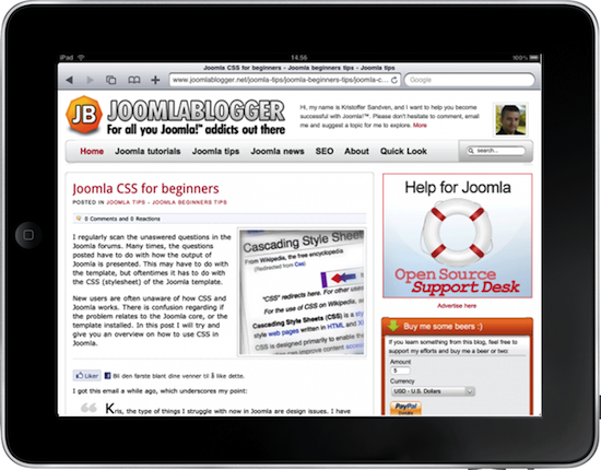
Note that the site has a right column with some ads and different elements.
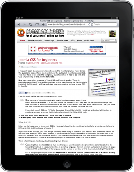
And below is the same page in portrait mode. I've removed the right column. I've also increased the size of the article heading and the article text. This improves readability when reading the article in portrait mode. I also added a banner below the main navigation.
How I did it
First, you have to decide on what to change. In my case it was fairly simple. I wanted to improve the reading experience for my blog posts, so I removed the right column. I also removed the banner outside the main frame (to the right). However, that removed most of the ads, so I decided to add an iPad specific banner to the portrait mode.
The iPad specific banner is placed into the 'top' module position in my template. As I don't use this position for anything else, I decided to hide it by default, using the following CSS:
Now, I had to create the iPad specific styling to remove the elements I don't need and add the ones I need when in portrait mode:
Same goes for the landscape mode, but in this case I just want to remove the banner on the right side.
So, that's it, basically. The specific styling you need to add depends on the template you're using. If you're unfamiliar with CSS, I recommend you read my article on Joomla CSS for beginners.
Use Firebug to determine what to change
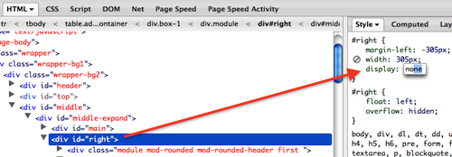
I really recommend using Firefox and Firebug to find out what elements to remove or change on the iPad. Firebug is an add-on to Firefox which gives you a lot of information about the CSS and HTML structure of a web page. When you have Firebug installed, you can right-click on an element and choose 'Inspect element'. The Firebug window will open at the bottom of the screen. Now, you can see the HTML structure on the left and the CSS on the right (see below). With Firebug, you can edit the stylesheet in the browser and see the changes immediately. That way, you can experiment before commiting the changes to your CSS file. Saves a lot of time.
In the below example, I've added a 'display:none;' to the DIV with ID 'right' to see what happens. When I did that, I realized I also had to reduce the margin of the main column to have it fill the entire width.
Adding an iPad icon
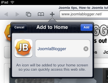
This is the icing on the cake. Adding an iPad icon to your site will make the iPad (or iPhone) use this icon in place of a screenshot when you add the site to the home screen.
This type of icon needs to be a PNG or JPG no larger than 114x114 pixels. Don't use transparency and don't add the shine effect (that's done by the iOS).
I created this icon for JoomlaBlogger.net:

Add the icon to your template folder. Then, reference it in the HEAD tag of your index.php file by adding the following meta tag:
Now, your users can add the website to their iPad (or iPhone) Home Screen and have your special icon displayed.
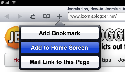
In mobile Safari, tap the + symbol and tap "Add to Home Screen":
Choose a title for the Home Screen icon:
The icon appears on the Home Screen:
Go do it!
I hope this has inspired you to try and do some iPad / iPhone optimization. In my opinion, these kinds of improvements work best when they are transparent to the user. Meaning the user doesn't notice the difference immediately, but simply gets a better experience from your site.
Did you optimize a site for iPhone or iPad? Tell us about it the comments below.