

Yesterday, the main Joomla site, joomla.org, got a new design. The design has been in the works for quite a while, and finally it's here.
Personally, I think the new front page is a lot cleaner and structured in a better way than the previous one. It conveys a more professional and perhaps corporate (is that a good thing...?) look than before. Focus is on where to get Joomla, what is Joomla, who uses it, as well as news items from different sources. The news sections are easier to spot now, and you spend less time looking at the page to determine if something is new or not.
On the inside
On the sub pages, the menu text size on the left side is a lot bigger than before. All of the menus and sub menu items are shown at once, for instance in the About Joomla section. I now find it easier to locate information. Things are not as hidden on the site as it used to be, and it is easier to get a quick overview of what the sections contain.
I'm a bit curious as to why they have chosen to set the font size for the body text to 14px and the line-height to 1.3. For me, the text becomes a bit too big and too tight. I would have either decreased the font-size or increased the line-height (to perhaps 1.6?). But that is my subjective opinion on the matter - you might of course have another.
All in all, the new Joomla.org site looks a lot better than the old one, and comes across as more designed and thought through than the earlier iteration.
Congratulations to the design team and the community on the new face of Joomla!
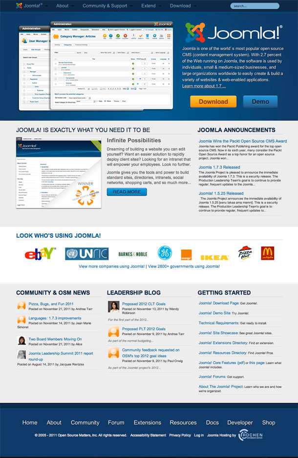
 look than before. Focus is on where to get Joomla, what is Joomla, who uses it, as well as news items from different sources. The news sections are easier to spot now, and you spend less time looking at the page to determine if something is new or not.
)